Thursday, September 23, 2010

Welcome to the World

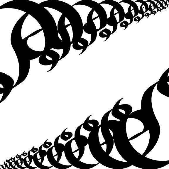
Ok, here are my finalized and properly titled Digital hw.
Hierarchy, "V"

Rhythm, "X"

Datum, "V"

Symmetry, "O"

Transformation, "S"
So there it is ladies and gentleman....wonderful wonders.
I also leave you with another Digital letter I toyed around with "J"...

Kermit the Frog- The Rainbow Connection

Man...I'm tired and hungry but the vegetarian goulash I ordered from dinner doesn't smell very good :(.
Sada day...ohman and today started out so well too...somewhat...OK, I'm rambling. G'night

~Alex

Verily so she said demurely

So, today was a rainy day. I need to go over my essay for Seeing Green (so many notes ohman Erica!!), I did however finish my Visual Culture essay today, which is a good thing since it was due today. Digital imaging class will happen in a few hours, I presume that once that class is over that I'll update this pointless posting with information about my hw.
Oh! On a fun note my wonderful baker of a cousin has asked me to digitize a design she created <3 I feel so professional. aha. I miss her brownies...
Of lately I have been happy. Foundations is going well, along with a majority of my classes. There are a few bumps here and there involving certain people at certain places but, que sera sera.
While waiting for our Digital Imaging teacher to go around to tell us whether or not we did things right I made some more letter art ahaha....ohmannn.


I leave you with this minute-long animation that I love dearly.
Garuda

Later ya'll~!
~Alex

Wednesday, September 22, 2010

Unusually Unqualified Unicorns

A lot of "u"s yay.
Anywhos, good evening blogosphere! I am uploading some of my Digital/Foundations hw onto you tonight (along with answering some Foundations responses from earlier today)
Even though I'm not sure which 5 categories these fall into for our Digital HW (Symmetry, Hierarchy, Rhythm, Datum, & Transformation)- I will tell you that I like the one that looks like a heartbeat..I think it shall be rhythm....
Now onto Foundations...a little spiel on why I chose the Figure/Ground picture that I did...
For my Figure/Ground I did a lot of sketches. I wasn't really sure what to do for the design; out of all of my sketches I was told that only a few made the cut and were "simple." Not to down trodden about that fact I decided to go with the Bird/Fox one- I don't remember if it was one of the designs that made the cut, nonetheless it came into being (probably due to the fact it had animals in it..and I liked it best).
Originally the Brid/Fox was supposed to be a Bird/Cat combo-such as in the art we saw where it was a Wolf and Little Red Riding Hood as the nose. Unfortunately the stylization of the eyes of the cat seemed more foxy to me. So. Fox. If one would like to make a fable connection perhaps one can conjure up the thought of the Fox asking the Bird for some grapes...

More Foundations, this time the response to the 6:30pm class...
During this class we watched short clips of the following artists: Kara Walker, William Kentridge, Jenny Holzer (who actually snuck into our viewing show through an accidental youtube video), and Barbara Kruger. We then went on to watch certain chapters from the movie Helvetica.
I shall now answer the assigned questions...oi vey.
An artist/designer's choice of type can influence the concept of their work because type adds attitude to a piece. If one were to use Papyrus font in a Western picture/design it certainly wouldn't have the same feeling if the artist/designer were to use Rosewood Standard font instead. For the impact or message of a piece the size, spacing, tracking, etc. of the font matters. If you were to do a piece that had to do with yelling and included font in it you wouldn't put a 12 point font on a 50x50 canvas, nay you'd use a rather substantially large font I'd think-unless you wanted to use a small font to represent that no matter how much you yell no one hears you...hmm....it all depends on the piece I suppose.

Differences between art and design are that designers, as one of the people we watched today said, "put wires into your head." Art is the creation of something while design puts it into action to draw the viewer in and envelope them in all its glory, methinks so at least. A difference in linguistics of a designer and artist could be that artists seem to have more emotions involved while designers have a system they work with. When artists discuss a piece they talk about their influences and for the most part the emotions they encountered before, during, or perhaps after the piece (or all three of them together); that's not to say that designers don't have emotion for their work but just less of it seems to influence their work I think...

Well, that's about all I can pull out of my hat of tricks tonight. Since my astonishing use of "u"s in tonights title I shall leave you with a classic...maybe only a classic to internet nerds....

Charlie the Unicorn

And I say goodnight to you sir/ma'am!

~Alex

Tuesday, September 21, 2010

Tut tut

I need to upload a picture of my Foundations HW thang along with all the thumbnails...

 Well the comp is fighting with me right now but I'll upload the pics later...onto doing digi hw.
Ok...updating now a day later...Here are some Illustrator thumbnails but I didn't get to do 5....


 The picture on my desk is the one I ended up doing (and not only that but reversing the colors and side the appeared on aha)...
Here are also pictures from today (9/22) of some work I did (but not happy over) in Foundations...

 We then did 9 2x2 square cutouts of different places on our piece of paper (I doodled more than did texture, lines & shapes D: )....

 It was like doing a puzzle but never getting the pieces in all the right places -sigh-..
Leave ya with this killer video
Anima Facta Est

~Alex

Monday, September 20, 2010

Sufferin' Suffacats

Found out that I was in fact doing the hw wrong -headdesk- Anyways, here are the rough sketches of the work and the finalized (and I accidently made it really small ahhh). All done on Illustrator except for the sketches ...

Uploading this again so you can compare the compositions

Yep...now my pinky feels very...not cool. For some reason who ever used this computer last made that everything I highlight a light violet color which is annoying me :/ lol. Anyways...I'm just glad I got this done....hopefully right this time...I used transparemcy...yayyyyy......Niiiiiight.
Whenever I was feeling down in Montana I would listen to this dude aha.

Wind Waker Unplugged

~Alex

Rabble rabble rabble

So, I'm not entirely sure if I did my Digital hw correctly but I am hoping I did so...
For the first part we did a composition of black and white circles. Then (I think) we were supposed to create a picture based off of said composition, it could have been a real picture or one from ones mind.
I honestly did change the composition a wee bit after I decided what picture I was going to use...
The picture I decided I'm make since it sort if matched the composition

You can find the artists deviantart here:Frecklefaced29.deviantart.com
and blogspot here: http://nnayam.blogspot.com/
And there she blows. I also did a previous version (below) but I wasn't to sure on it because I had 3 blocks of a lighter color with transparency because in the real picture it's lighter, buuut having them in the picture seemed a bit...awkward to me.
Later ya'll! Gotta do reading for Seeing Green class...
Leaving you with Cat Stevens...also anyone else see Harold and Maude? aha it's pretty good x)
Cat Stevens- If you want to Sing out

~Alex

Sunday, September 19, 2010

Quaint Update

Well, looky here Alex updating yet again today. What she be doing now? Why she's posting up her finalized pictures for Foundations (I also figured out that for the scanner room next door that it does in fact use the same code for the comp lab. good job.)

For the last one I did a lot of the lines from lyrics of different songs that I like :)

And now for the Field Guide Book...murr...I made this have a more child like feel because I remember when I was younger the parents would take me to National Parks for vacations and they would have "Jr. Ranger" programs and there would be decent drawings in it. So for my shoes I drew them by never taking the pen off the paper until I finished the shoes (except for when I did my shoes) to give them that certain look. Then my cheap coloring for them was also done to somewhat represent a kid coloring in the shoes (though the colors are based off of the real shoes I saw in the park...).
In my sketchbook I had done extremely rough sketches and notes of the shoes descriptions so for the majority of the shoes I had to look online for them and draw from those pictures aha.
I leave you with the video that doth maketh me laugh...eth...

Cool Guys Don't Look at Explosions

~Alex
also, I edited the Mucha hw a bit...