Anywhos, good evening blogosphere! I am uploading some of my Digital/Foundations hw onto you tonight (along with answering some Foundations responses from earlier today)


Now onto Foundations...a little spiel on why I chose the Figure/Ground picture that I did...
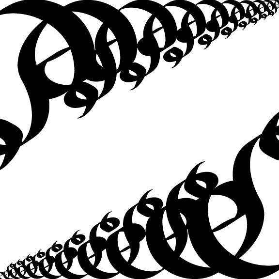
For my Figure/Ground I did a lot of sketches. I wasn't really sure what to do for the design; out of all of my sketches I was told that only a few made the cut and were "simple." Not to down trodden about that fact I decided to go with the Bird/Fox one- I don't remember if it was one of the designs that made the cut, nonetheless it came into being (probably due to the fact it had animals in it..and I liked it best).
Originally the Brid/Fox was supposed to be a Bird/Cat combo-such as in the art we saw where it was a Wolf and Little Red Riding Hood as the nose. Unfortunately the stylization of the eyes of the cat seemed more foxy to me. So. Fox. If one would like to make a fable connection perhaps one can conjure up the thought of the Fox asking the Bird for some grapes...
More Foundations, this time the response to the 6:30pm class...
During this class we watched short clips of the following artists: Kara Walker, William Kentridge, Jenny Holzer (who actually snuck into our viewing show through an accidental youtube video), and Barbara Kruger. We then went on to watch certain chapters from the movie Helvetica.
I shall now answer the assigned questions...oi vey.
An artist/designer's choice of type can influence the concept of their work because type adds attitude to a piece. If one were to use Papyrus font in a Western picture/design it certainly wouldn't have the same feeling if the artist/designer were to use Rosewood Standard font instead. For the impact or message of a piece the size, spacing, tracking, etc. of the font matters. If you were to do a piece that had to do with yelling and included font in it you wouldn't put a 12 point font on a 50x50 canvas, nay you'd use a rather substantially large font I'd think-unless you wanted to use a small font to represent that no matter how much you yell no one hears you...hmm....it all depends on the piece I suppose.
Differences between art and design are that designers, as one of the people we watched today said, "put wires into your head." Art is the creation of something while design puts it into action to draw the viewer in and envelope them in all its glory, methinks so at least. A difference in linguistics of a designer and artist could be that artists seem to have more emotions involved while designers have a system they work with. When artists discuss a piece they talk about their influences and for the most part the emotions they encountered before, during, or perhaps after the piece (or all three of them together); that's not to say that designers don't have emotion for their work but just less of it seems to influence their work I think...
Well, that's about all I can pull out of my hat of tricks tonight. Since my astonishing use of "u"s in tonights title I shall leave you with a classic...maybe only a classic to internet nerds....
Charlie the Unicorn
And I say goodnight to you sir/ma'am!
~Alex

No comments:
Post a Comment